
Manager Commentary-Archive
Manager Commentary, 1st Quarter 2018
JEKYLL and HYDE QUARTER
The first quarter of 2018 was remarkable in several ways. We saw record highs in equity markets, but also a fierce resurgence in volatility. To some degree, the first quarter was a Jekyll and Hyde type of period. The first half of the quarter was characterized by a low volatility, momentum driven, continuation of the themes that carried 2017. While the second half of the quarter brought in a new regime, with explosive volatility, a refocusing of investors attention on fundamentals, and new leadership in the market. The rest of our commentary this quarter will help explain how the Perritt MicroCap Opportunities Fund (“the fund”) performed during these two distinct market environments, and the reasons behind that performance.
As an active manager, the fund has a less than 1.0 correlation to its benchmark as of 3/31/18. This is driven by distinct sector weight differences, weighting of individual stocks in the portfolio, and stylistic investment differences from the composition of the benchmark. The fund has regularly experienced significant positive and negative deltas in performance relative to the benchmark.
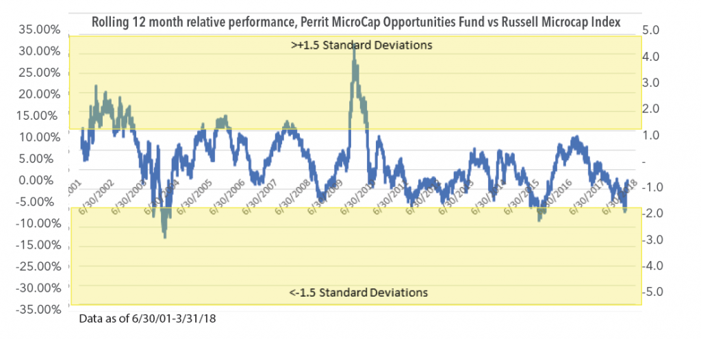
Below is a chart of the rolling delta of trailing 12-month performance between the fund and the Russell Microcap Index (“the benchmark”) as of 3/31/2018:
Click here for performance.
Performance data quoted represents past performance; past performance does not guarantee future results. The investment return and principal value of an investment will fluctuate so that an investor’s shares, when redeemed, may be lower or higher than the performance quoted. Performance data current to the most recent month end may be obtained by calling 800-331-8936.
We find the 12-month rolling performance delta, from the 6/30/2000 inception through 3/31/2018, to be a highly mean reverting series. The average 12-month performance delta since the inception of the benchmark data (6/30/2000) is +2.3%, reflecting our long-term outperformance. The standard deviation is 7.2%, which indicates that there can be periods where we significantly outperform or underperform.
On a trailing 12-month basis, our performance relative to the benchmark Russell Microcap Index during the first quarter of 2018 reached -10.83%. This represented -1.8 standard deviations from our mean rolling 12-month performance since 2001. An extreme that lies in the bottom 98th percentile of relative 12-month returns. This was an outcome we were quite unpleased with, but one we understood to be an extreme, and yet, also not unprecedented. After being participants in the U.S. Microcap equity market for nearly 30 years, we understand cycles, even extremes ones, come and go. Historically however, +/- 1.5 standard deviations has been a reliable inflection point for mean reversion of our relative performance.
In the final analysis, we believe a confluence of market factors led to this recent period of underperformance, which hit a nadir in the middle of the first quarter of 2018. We trace the sources of this underperformance to the following factors: 1) disproportionate share of market gains being produced by narrow segments of the market, which we do not participate in, 2) outperformance of larger markets capitalization names within the index, vs. the sub-$500mm market capitalization segment we target, 3) stylistic headwinds, namely growth outperforming value, and 4) larger errors of commission than our historical average. It was our belief that many of these factors are reliably mean reverting. And thus, we expected performance to rebound from the February lows. Which it did in the second half of Q1, wonderfully.
We expect our performance to continue to positively and significantly mean revert. Despite the cyclically of underperformance and outperformance periods, the fund has outperformed its benchmark since inception.
Drivers of Recent Underperformance
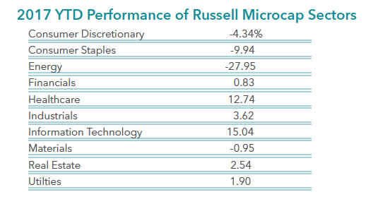
1. Concentration of benchmark performance in Healthcare (Biotech/Pharma) and Technology (Internet Software/Software):
Below is the Russell Microcap Index attribution from 3/7/2017-3/7/2018. This period captures the trailing 12-month period ending at the low point of our recent underperformance cycle.
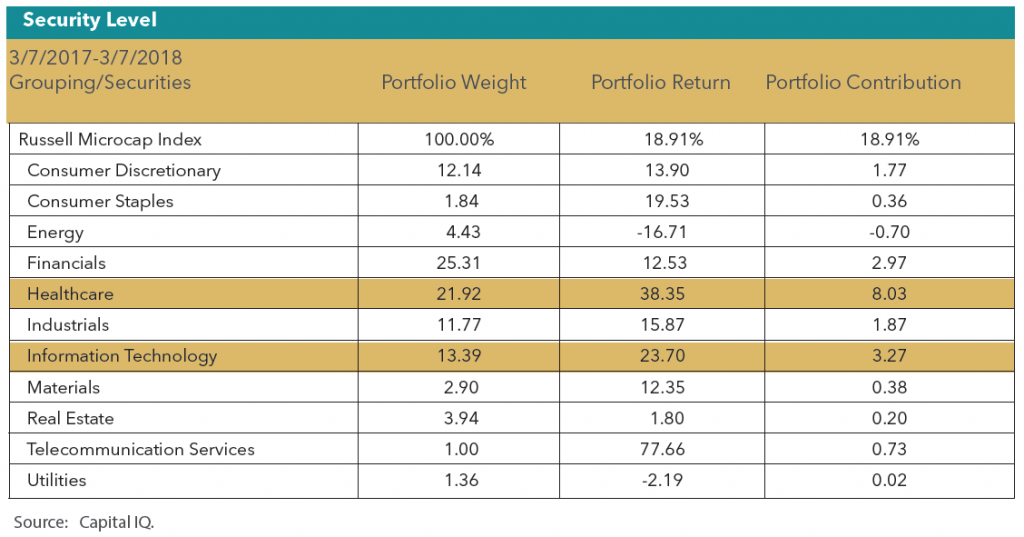
The Russell Microcap Index gained 18.91% from 3/7/2017-3/7/2018. However, the majority of sectors “underperformed.” Two sectors alone drove 60% of the index performance. Healthcare, which gained +38.35%, added +803bps to the return and technology, which gained +23.70%, added +327 bps to the return.
The Telecomm sector performance was primarily driven by a single company being acquired (STRP), and the sector’s low weighting (1.0%) causes the contribution to be relatively immaterial. The Healthcare (index weight of 21.9%) and Technology (index weight of 13.4%.) sectors were the strongest contributors within the Russell Microcap Index.
Roughly 40% of the index performance has been concentrated in the subsectors of Biotechnology, Pharmaceutical and Software. As a value-oriented manager who strives to build a portfolio of securities issued by companies with sustainable, profitable business, we find ourselves unable to generate many investable ideas in these subsectors. During the prior year, the fund maintained a 0% exposure to the Biotech/Pharma sectors, and a 2.8% exposure in Software, all significantly below the benchmark weights.
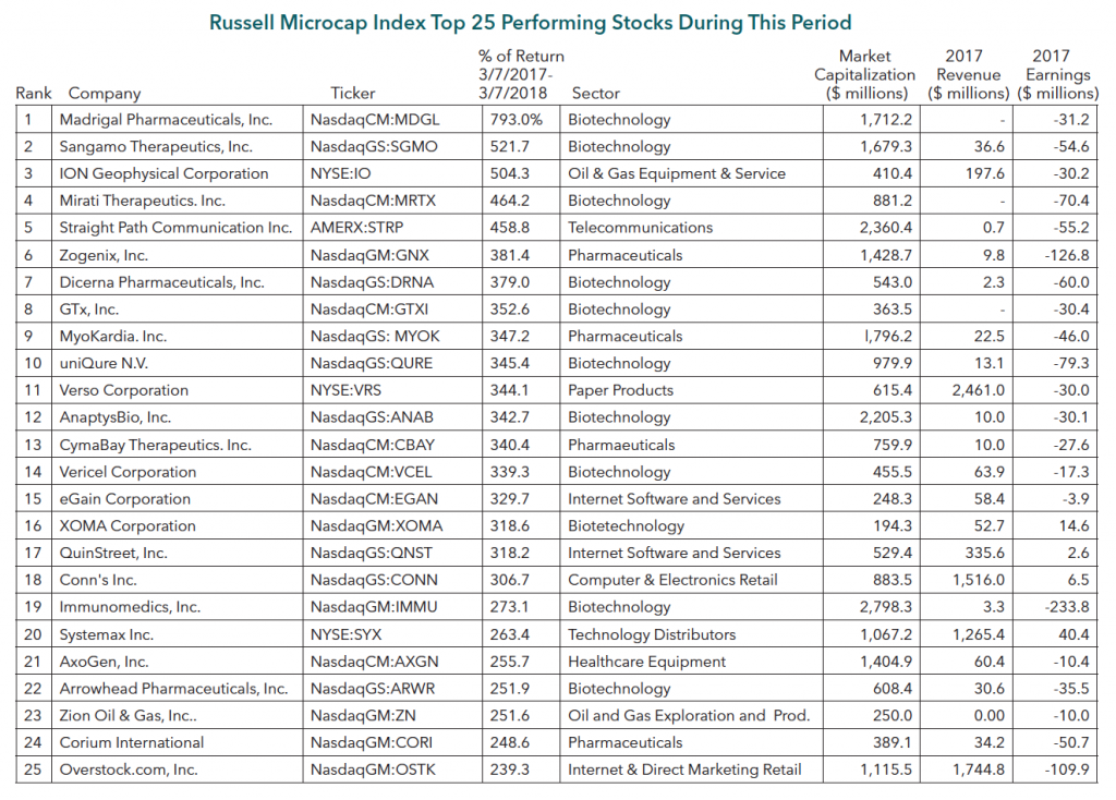
Of the top twenty-five performing stocks in the index, fifteen are Biotech/Pharma related. Of those same twenty-five, only four are profitable companies, and nine have $10mm or less in revenues.
The top 25 performing stocks show an unusual degree of extreme price performance with an average gain of 359%, as well as narrow industry concentration.

2. Performance By Market Capitalization segment 3/7/2017-3/7/2018:
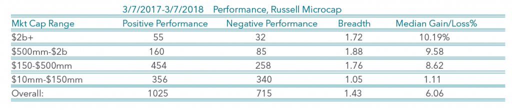
Stocks with larger beginning market capitalizations significantly outperformed stocks of smaller sized companies. The fund targets companies with market capitalizations of less than $500mm, and has a median market cap of $309mm.
3. Growth vs. Value
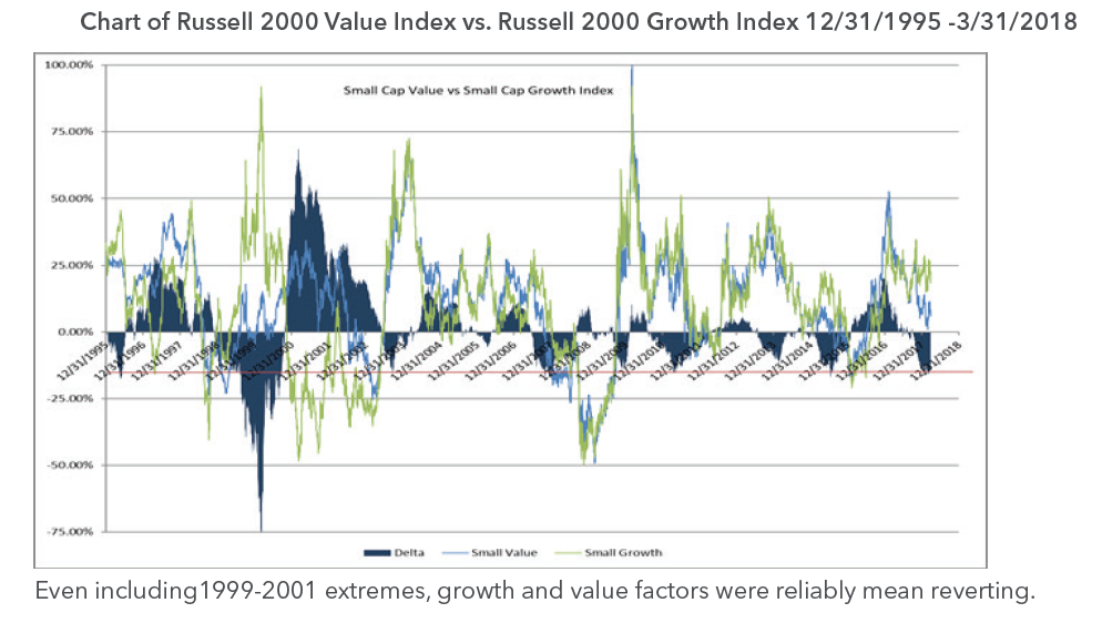
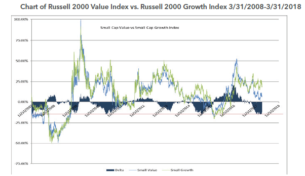
Growth has significantly outperformed value in the previous 14 months. We find growth vs. value relative performance to be highly mean reverting. The level of growth outperformance reached in Q1 2018 has previously been an inflection point a number of times over the past 10 years.
We also measure growth vs. value by the performance of securities grouped by valuation:

Higher multiple stocks have significantly outperformed stocks trading at lower valuations. The fund median revenue multiple is currently approximately 1.0x, less than half the Russell Microcap Index median revenue multiple of 2.1x.
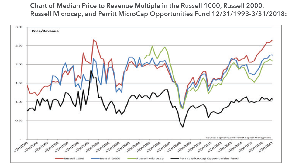
As a value focused manager, we have historically managed the fund with a significantly lower level of valuation than the broader markets and benchmark. We find broader market valuations to currently be well above average. In our opinion, the securities we have in the portfolio provide a better long-term risk/reward opportunity.
4. Errors of Commission
The fund’s top and bottom performers as measured by contribution to the fund’s performance:

As our mission has always been, the fund has continued to capitalize on unique opportunities we find in the microcap asset class. Our top five performing positions contributed +635bps to our return. However, our bottom five performing positions detracted -423bps. While it is of significant importance in our minds to have your winners contribute more than the losers detract, the spread of winners-losers was less than we target. Historically, we have a positive spread in our top five vs. bottom five. In the preceding 5 years (2011-2016), we had a ratio of top five contribution to bottom five detraction of roughly 3:1. In the recent period this ratio is 1.5:1. The narrower spread has been driven by larger than historical detractions by individual positions.
Mean Reversion and the Performance Turnaround
As we’ve now stated many times in this commentary, we firmly believed our performance had potential to recover based on the historical evidence that many of the drivers of our underperformance we’re reliably mean reverting. From 3/7/2018 through the end of the quarter, the Perritt MicroCap Opportunities Fund gained +2.97%, while the benchmark declined -2.86%, for a performance delta of +583bps in three and a half weeks! This cut our rolling 12 month performance delta to the benchmark down to -3.06%.
While we believe that the securities purchased for the fund’s portfolio trade at significant discounts to intrinsic value, the timing of the realization is often highly uncertain. In many cases, securities can trade at a significant discount for years. This can weigh on fund performance in the short term, as we hold these securities awaiting closure of the intrinsic value to market value gap. In our experience, the gap to intrinsic value, which may have been stubbornly persistent for years, can dramatically narrow in very short periods of time. As examples, we saw this dynamic in late Q1 in our top two holdings, BXC and ADUS.
BlueLinx Holdings Inc. (BXC), our top holding, is a stock that had underperformed the market for years. The company recently announced two major catalytic events, a real estate divestiture and an acquisition, which we had anticipated, and the stock moved from the $15 range to $32 to close the quarter (and now $41 as of 4/23/2018). This is a 100%+ gain in a 3 week period from a stock which had “gone nowhere” for years.
Addus Homecare Corp. (ADUS), our second largest holding, presents a similar, though admittedly, less extreme case. Nevertheless, ADUS highlights how quickly the performance contribution from a single position can change from being a detractor to a contributor. We have held ADUS for many years and have a cost basis of less than $7 per share. The stock closed the quarter at $48 (and is $54 as of 4/23/2018). Though a significant contributor to long-term performance, it is not a consistent contributor to performance. As an example, the stock closed 2017 down -1%, vs. a gain for the Russell Microcap index of +13%. ADUS was a significant drag on the Fund’s performance for the calendar year 2017, despite being a hugely successful long term holding. After announcing an acquisition in Q1 2018, the stock moved from ~$34 to $48 to close the quarter. The stock is now again outperforming the market, and a positive contributor to relative performance.
The combination of reliably mean reverting factors reversing from a headwind to a tailwind, discussed at length in this commentary, and the opportunity to generate significant individual security alpha, gives our team confidence in our ability to seek to continue our long-term outperformance going forward.
Manager Commentary, 4th Quarter 2017
YEAR IN REVIEW
Worry?
There is an old saying on Wall Street that the markets climb a “Wall of Worry.” The past quarter and year certainly had several concerns, but the markets continued higher and finished the year at all time highs. Some of these recent concerns were several Hurricanes. Hurricane Harvey came first, pummeling Houston on August 25th. Less than two weeks later, Irma battered the Caribbean and Florida. Jose and Maria followed shortly after, striking the Caribbean and crushing Puerto Rico’s infrastructure. The cost is estimated to be in the hundreds of billions of dollars and will take years to repair. The financial markets hardly noticed.
Hurricanes were not the only concern. There were political debates over health care, the debt ceiling, the National Football League and the Russian investigation. Then there were words raged between North Korea’s supreme leader Kim Jong Un and President Donald Trump. The belated announcement of a data breach at Equifax, potentially impacting nearly one in every two Americans, increased the already big concern about cybersecurity. How about all the Trump Twitter Tweets? It goes on and on. I think you get my point. The bottom line is that it seems that nothing will bring this market down, and it continues to climb that “Wall of Worry.”
Market Results
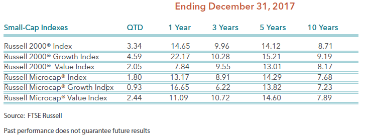
For the fourth quarter of 2017, large stocks continued to be the leader. The S&P 500 Index climbed more than 6% in the fourth quarter and rose by more than 20% for 2017. Smaller stocks performed well, but lagged their large cap brethren. The table above shows the performance results for the small/micro-cap indexes from Frank Russell & Company. During the past year, growth trumped value in both small-cap and micro-cap indexes. However, value outperformed growth within the micro-cap indexes in the fourth quarter. We are not sure if value’s leadership within micro-cap stocks is in a leadership reversal.
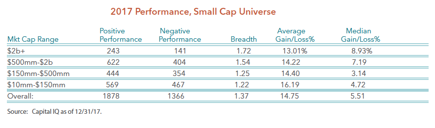
A deeper drive into the small/micro-cap universe shows that while the breadth was strong, it was not as strong as one might think given the gains last year. The table below shows the number of stocks that posted gains versus the number of stocks posting losses last year. Of the 3,244 publicly traded small/micro-cap stocks, 1,878 rose last year while 1,366 declined last year. A more interesting data point is that while the standard stock climbed nearly 15% last year, the median gain was only 5.51%. To us, the true standard company’s stock did not perform well last year. We believe there is a decent chance that the standard stock may do better in the future. Let’s look at several factors that could influence small/micro-cap stocks in 2018.
Interest Rates
Including yours truly, there have been many professional investors that have been forecasting higher interest rates for many years. The Federal Reserve spent the past year beginning the process of resetting short-term interest rates. Bond vigilantes may follow this year and reset yields. However, there have been several times in this recovery when bond yields attempted to rise only to be terminated and reversed. The obvious reason for this is that the U.S. economic data turned soft, but we think most of the blame came from other markets, which included Eurozone blowing up, China economy slowing, or various other global economic issues. This period, however, the U.S. recovery is broader, global recovery is more synchronized, confidence is stronger among businesses and individuals, and we are closer to full employment than ever.
The 10-year Treasury yield is currently just above 2.60%, which is up from 2.12% from July 2017 and 1.46% in June 2016. While inflation is still relatively low, it appears inflation is rising, and more importantly, inflation expectations appear to be on the rise. Should evidence support an increase in inflation, it should force yields to head even higher. Bonds have been in a bull market for more than 30 years, but given the current economic backdrop we believe the bond bull market is over. Even the charts support this theory. If you examine the long-term trend line of all the government bond yields, you will see most government bonds have broken their long-term trend line. The 30-year Treasury Bond is the only bond that has not broken the long-term trend line. We believe once the 30-year Treasury Bond breaks its long-term trend line, the bond market will officially enter a bear market. We have often said that rising interest rates are not a bad thing for smaller stocks. Smaller stocks have performed well in rising interest environments. Please refer to our white paper on Interest Rate Hikes and Small Cap Returns.
Tax Cut
The Trump Administration was successful in lower taxes for corporations. It depends on your individual situation, but taxes were lowered for some individuals too. The corporate tax rate was permanently lowered from 35 percent to 21 percent, which brings the rate closer to countries like Canada at 15 percent and Ireland at 12.5 percent. Analysts are busy reviewing financials to adjust their earnings estimates for 2018 and 2019. Since several companies have operations around the world and some have tax deferred assets that need to be adjusted or written down, the adjustment to earnings estimates is not that easy. We, and many analysts have a great deal of homework. Earnings estimates need to be adjusted for these new facts. Regardless, estimates for the several companies will be on the rise, which we believe should be a net positive for stock prices. In addition, we believe higher corporate profits and increased cash flow should bode well for merger and acquisition activity. As you may have seen from our research, as of 12/31/17 nearly 60% of all public merger and acquisition activity occurs at the micro-cap level. Please refer to our white paper on Top 10 Reasons to Invest in Microcap.
U.S. Economy and Global Growth
The U.S. economy experienced two quarters in a row of economic growth above 3%, and unemployment is near a 50-year low. The Trump Administration continues to lobby for its pro-growth agenda. The pro-growth agenda includes slashing onerous regulations that have stifled business, a proposed $1 trillion infrastructure spending schedule for this year, a signifi- cant increase in military budget, and the already passed tax cuts discussed above.
Global growth is improving overseas too. We are in the middle of a global economic growth recovery which has provided strong support for market gains. For the first time since 2007, all 45 economies tracked by the OECD (Organization for Economic Co-operation and Development) Composite Leading Indicators Index have positive GDP growth for the year. Furthermore, despite minor interest rate increases in the U.S., global central bank policies remain very accommodating with low interest rates around the world. Most importantly, recession risk in the next year could be low.
There are few excesses you would normally associate with a recovery like this one. Both household and businesses have strong and liquid balance sheets, and will likely improve with the recent tax cuts. The Leading Economic Indicators (LEI) just rose to a new all time high. In our view, the U.S. has not experienced a meaningful capital spending cycle since the Dot-com boom in the 1990s, but we believe the conditions are more conducive for investments. We would not be surprised if the U.S. economy produces growth near 4% or more in one of the quarters this year.
Valuations and Investment Outlook
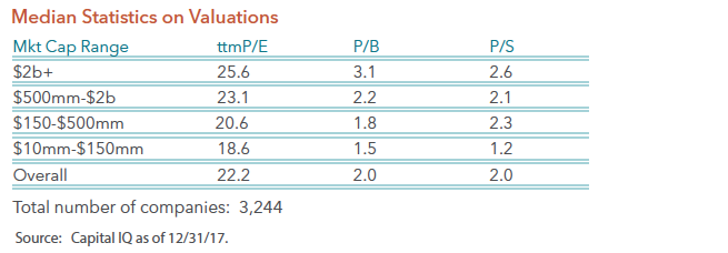
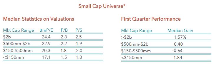
Given the fact that stock prices rose by double digits in each of the past two years, and corporate profits rose, but by less than stock prices during that period, one should be concerned about valuations. We certainly agree that valuations are not cheap. Just review the table below. This is the small-cap universe of 3,244 companies broken down for various market capitalization ranges. The typical company within the small-cap universe trades at more than 22 times trailing earnings, which is not cheap in our opinion. However, with the economy still improving and corporate tax cuts now in place, earnings growth should be very robust this year, which means valuations may be lower in the future.
Given our thoughts on interest rates, tax cuts, and the global economy, our investment focus remains on capital good sectors. Throughout most of the bull market, leadership has been concentrated among consumer stocks and bond surrogates. However, investment spending seems to be in a position to drive the capital goods area. We view the four major capital good sectors as technology, industrial, materials, and energy. We believe technology represents the leaders and are characterized by string secular unit growth. Industrials offer a play on global infrastructure revival. Materials are the quintessential inflations play in the economy, and are likely to face intensifying overheat pressures. Lastly, Energy offers a contrarian play, but good value which could benefit from rising inflation and higher yields. While we will not entirely ignore the other sectors of the economy, it is likely that these capital good sectors will be our larger weights within the portfolios.
Manager Commentary, 2nd Quarter 2017
2nd QUARTER REVIEW
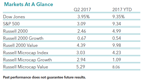
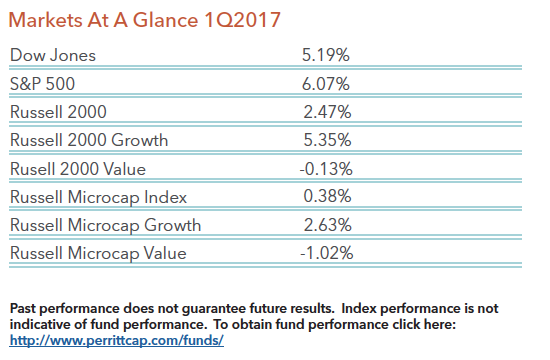
The second quarter performance for the stock market was very much like the first quarter performance. Large stocks performed well and growth stocks outperformed value stocks. The table below details the performance for large stocks and small stocks for both the second quarter and year-to-date.
Whether it is large stocks or small stocks, technology and healthcare stocks continue to dominate the performance charts. The table below provides the performance results for each sector within the Russell Microcap Index. As you can see, technology and healthcare stocks were the only stocks that produced double digit returns through the first six months of the year. It has been a very poor period for consumer and energy stocks, as they declined significantly during the past six months.
While the equity markets have performed well in the past six months, most of the gains are attributable to multiple expansion. As fundamentalist, we would prefer to see decent revenue and earnings growth along with strong price appreciation. We, and many other strategists, believe earnings growth will improve dramatically in the next year or two. This confidence in future earnings growth makes us believers in this bull market. However, valuations across the marketplace are starting to look rich. The next table below outlines three valuation measures for the large cap Russell 1000 Index and the small stock Russell 2000 Index and the Russell Microcap Index. While not at peak valuations levels, these multiples are lofty relative to anytime in history.
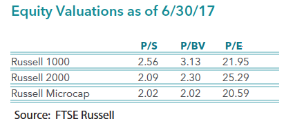
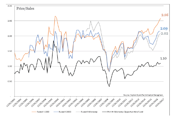
The chart below shows the historic price-to-sales ratio of each index we reviewed above, as well as the historic price- to-sales ratio for our flagship MicroCap Opportunities Fund. As you can see, large cap valuations on this chart have been going straight up for about a year and a half, and are now at peak valuations. The Russell 2000 and the Russell Microcap Indexes are near peak valuation levels too, but remain well below the valuations of the large-cap Russell 1000 Index. While our MicroCap Opportunites Fund has almost always traded at lower valuation levels than that of the market indexes, the Fund is now trading at the widest discount to the indexes in 24 years. This valuation discount gives us confidence in our portfolio of companies versus that of the rest of the market. (The current P/S ratios for the Perritt Ultra Microcap and Low Priced Stock funds are also significantly lower than the market at 1.16 and 1.39 respectively.)
Manager Commentary, 1st Quarter 2017
1ST QUARTER REVIEW
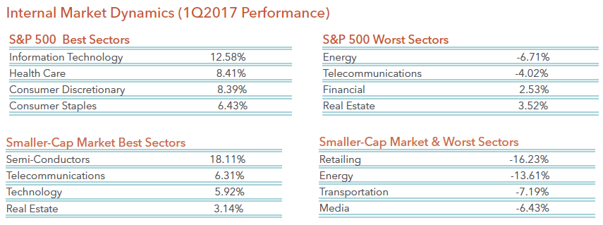
The first quarter of 2017 was an interesting quarter in that performance was a reversal of 2016 and particularly the fourth quarter of last year. As you can see from the table below, larger stocks outperformed smaller stocks. As measured by the S&P 500 Index, large stocks gained more than 6 percent while micro-cap stocks barely produced a gain, as the Russell Microcap Index rose by only 0.4 percent. In addition, growth stocks outperformed value stocks in the first quarter, which is also the opposite of what happened last year.
While not a surprise, the internals of the markets show us exactly why growth stocks outperformed value stocks. Below is a table of the best and worst performance for each sector within the S&P 500 Index, as well as the best and worst performance for each sector within the smaller-cap market. Technology and health care sectors were best performers in the first quarter. Technology and health care sectors are typically found within growth-oriented indexes, while energy and financials can be found in value-oriented indexes.
A closer look within each of these sectors reveals that high return on invested capital (ROIC) companies performed worse than the rest of the market in the first quarter. For example, the top 25% of ROIC companies’ stocks declined 1.91% versus a 2.86% gain for the bottom 25% of ROIC companies. We view this recent underperformance as a short-term reversal from the past year, but not a change in trend. In other words, high quality companies have been the leaders in the past year, and we expect them to resume their leadership later this year. Let’s review a few of the reasons we remain optimistic.
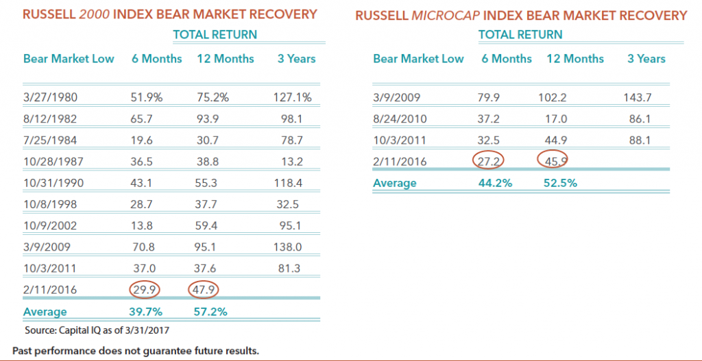
First, we believe we are still early in the bear market recovery or new bull market for smaller-cap stocks. As we noted in our commentary a year ago, the bear market for smaller companies ended on February 11, 2016. Since that date, smaller companies have performed well, but certainly not in a straight line. We also noted in our commentary that bull markets usually don’t end within a year. Bull markets tend to last at least a few years. We updated our tables of bear market recoveries below. As you can see from the two tables below, the 6-month and 12-month performance for the current recovery are approximately 10 percentage points behind the average for the Russell 2000 Index, and approximately 12 percentage points behind the average for the Russell Microcap Index. These results give us confidence that the future 3-year performance for the current cycle could be similar to the past averages.
Second, we are forecasting strong earnings growth for smaller companies. While earnings growth in the past year was only slightly positive, we have indications that earnings growth should improve in the future. According to our internal research, we believe earnings growth should be in the double-digit range this year, as well as next year. While valuations are not cheap, strong earnings growth should justify current stock prices as well as higher prices in the future.
Lastly, the Trump Administration has several initiatives that are pro-business. Some of those initiatives include tax reform, regulation reform, and various infrastructure improvements. While it is unlikely that most of these initiatives will make it past congress, some will, which will be positive for equity markets.
Manager Commentary, 4th Quarter 2016
SURPRISE!
The fourth quarter and 2016 brought several surprises to investors. Fortunately, many of those surprises were positive. The first surprise came earlier last year when the British decided to exit the Euro (Brexit). While initial market reaction was negative, the proceeding weeks that followed was a strong rally for equity investors around the world. The next surprise occurred in the fourth quarter when Donald Trump won the Presidential election and the Republicans swept control of Congress. Once again, the initial market reaction was negative, but the stock market rebounded by more than 10% in less than two weeks from the low on election day. While it makes intuitive sense that the stock market would rally, I believe most investors were surprised by the rally, particularly the degree of the rally.
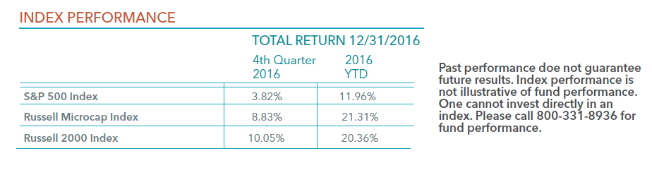
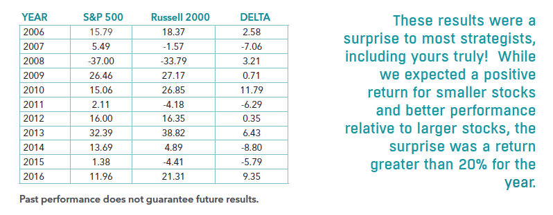
As you can see from the table below, the fourth quarter and year were very fulfilling for investors. As measured by the S&P 500 Index, large stocks rose 3.82% in the quarter and finished up nearly 12% for the year. For the first time since 2013, small stocks Trumped (sorry I couldn’t resist) large stocks. As measured by the Russell 2000 and the Russell Microcap Indexes, smaller stocks rose 8.83% and 10.05% in the quarter and 21.31% and 20.37% for the year, respectively. These results were a surprise to most strategists, including yours truly! While we expected a positive return for smaller stocks and better performance relative to larger stocks, the surprise was a return greater than 20% in both indexes for the year.
The strong results last year were certainly a nice surprise, but it does concern us that we might be borrowing returns a bit from the future. The Russell 2000 Index trades at more than 20 times earnings, which is the highest level since 2001. However, earnings growth is expected to be near 15% and could be much higher if Trump is successful in lowering corporate taxes. Another concern is that if the Federal Reserve hikes interest rates too aggressively, it could slow economic growth. The bottom line is the strong rally in the past year might be priced in the market already.
As we have said, this past year has been full of surprises, and it wouldn’t surprise us if next year was similar. For many strategists, the ritual of predicting the future is just an ego trip. As Benjamin Graham inferred, forecasting where the markets will be a year from now is nothing more than rank speculation. We prefer to focus on what we view as quality companies for our funds and review history as a guide of how the future may be formed. The table below is the annual performance of the S&P 500 Index, the Russell 2000 Index and the delta of these indexes performance. Small stocks tend to perform in streaks. That is, once they perform well in one year, they tend to perform well for several years. Since last year was the first year small stocks outperformed in a couple years, we believe the odds are above average for another strong year in 2017 for small stocks. We outline this small stock performance lesson in a white paper entitled Deja vu All Over Again: Serial Correlation and Micro-Cap Equities.
Finally, according to Investment Company Institute, we estimate that investors have pulled nearly $1 trillion from domestic equity mutual funds and domestic ETFs since 2005. This level of investor redemptions is unprecedented. Since Trump’s election though, investors have started pouring money back into domestic funds. We estimate that investors have purchased more than $25 billion of domestic mutual funds and ETFs in the past two months. We believe the 2017 surprise could be that individual investors continue that buying frenzy of domestic equities, which could help power equity prices higher again.
The State of the IPO Market
What Makes for a Good IPO Investment? A Whitepaper on IPOs since 2012
Investors continually debate the value of initial public offerings, or IPOs. On the one hand, investors see the soaring initial returns for a company after its IPO, and want to know how to think about investing in such a stock, and perhaps how to invest in the opportunity. On the other hand, many IPOs “break”, or fall below the initial offering price, at some point sooner or later after the IPO date, and investors then regret jumping into the stock.
- Is an IPO a chance to invest on the ground floor of a potential winner, or a trap for investors that benefits only the founders and their bankers?
- Is a broken IPO a failed investment, or a hidden opportunity?
We set forth to understand the factors these days that drive performance of stocks after an IPO. We want to know what drives value, what causes an IPO to break, and how smart investors can take advantage of IPOs for individual portfolios. Many other scholars and analysts have researched IPOs over the decades. One of the most cited efforts, studying IPOs from 1975-1984, affirms that IPOs perform well in their first few days or weeks, followed by as many as three years of underperformance.(1) A similar analysis affirms this conclusion, with the additional finding that the timing, both for the IPO and for the period analyzed, can affect the results.(2)
We applied the approach from this research to more recent IPOs, to see what we can learn about the environment in the past few years.
- Performance of an individual IPO depends mostly on valuation of the shares at the time of the IPO. Not surprisingly, companies with higher valuations tend to decline in value sooner or later after an IPO while companies with more moderate valuations improved.
- IPOs are more “popular” in some instances than in others. By this we mean the timing (year) of the IPO and the industry sector also influence performance. IPO pricing and valuation was higher in some years and for some industry sectors than in others. In this analysis, IPOs from 2012 and 2013 per formed better than ones from 2014 and 2015. IPOs in biotechnology per formed worse than those in other industry sectors.
- A relatively smaller number of IPOs have outperformed the rest significantly. An astute investor can find suitable IPOs for investment, if he or she has the discipline to invest at reasonable valuations, and the patience to allow IPO companies to reach that valuation.
Over 700 IPOs
We assembled a data set of all US IPOs from 2012 to the present. This data includes 721 individual companies that undertook an IPO from January 1, 2012 to March 31, 2016 (Table 1).
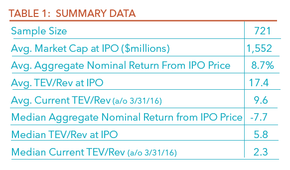
These companies varied considerably in size. The smallest were under $10 million in market capitalization at the time of the IPO. The largest were in the tens of billions of dollars, including Facebook (NasdaqGS:FB) at $82 billion in 2012 and Alibaba Group (NYSE:BABA) at $231 billion in 2014. The average market capitalization for all IPOs in the data set was $1.54 billion at the time of IPO.
We immediately see some interesting results for these companies.
Overall, negative returns: The median share price return was -7.7% since the IPO date. Yet, the average share price return was 8.7%, suggesting that a small number of very strong performers dominate IPO performance. (Note the return statistics presented represent total share price change since IPO, and are not annualized or adjusted for performance compared to a benchmark.)
Valuation declines: Valuation, expressed as the ratio of total enterprise value to trailing annual revenues, declined significantly since the IPO date. Yet, some companies dominate the valuation. As of the IPO date, the median valuation was 5.8. As of today, the median valuation declined to 2.3, less than half of the valuation on the IPO date. Similar to returns, a small number of IPOs outperformed the others.
The average valuation as of the IPO date was 17.4, reflecting very high valuations for a small number of companies. This average valuation declined to 9.6 as of March 31, 2016.
Larger Companies Performed Better
We analyzed IPO performance relative to company size. We divided the data set into four market capitalization groups (Chart 2).
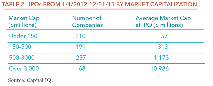
Among these groups, the largest companies performed better than small ones (Chart 1).
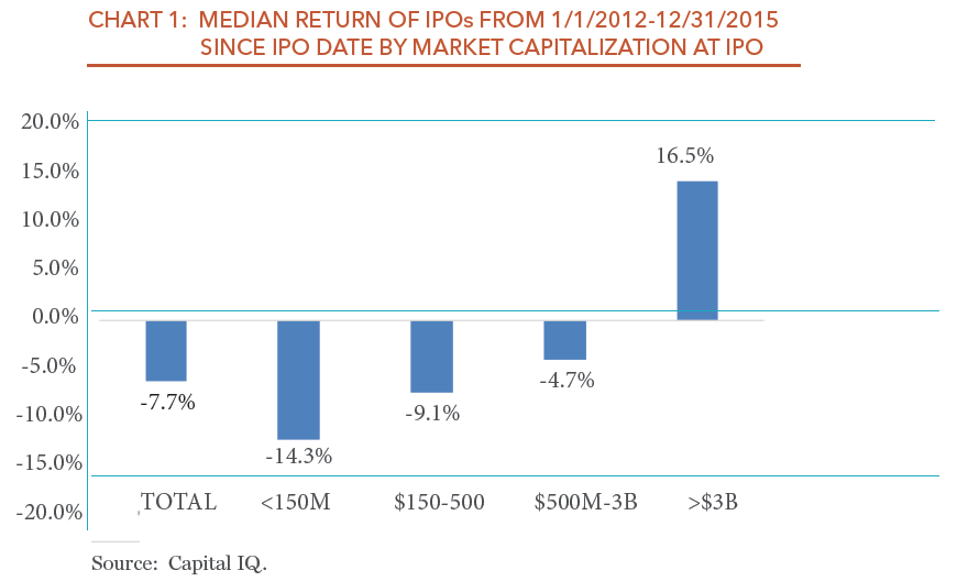
Small cap value investors should find this result encouraging. It suggests a large number of companies that went public since 2012 could represent an attractive investment.
Smaller Company IPOs Broken More
IPOs that “break” trade below the initial offering price. They can do this at any point after the IPO date. Broken IPOs may offer an attractive investment opportunity:
- On the one hand, an IPO with a current price below the IPO price may offer the potential returns that first-day investors sought, but at a reasonable price
- On the other hand, a broken IPO may break for a good reason, namely first-day investors mispriced it, and believed they jumped into an opportunity that was likely to deliver suitable value.
For purposes of this analysis, if an IPO trades below the IPO price as of the date of this analysis (January 2016), then it is considered broken, without regard to the date of IPO.
Within the data set, more IPOs were broken (421) than unbroken (300) (Table 3). The market capitalization of the broken IPOs was considerably smaller, at an average of $921 million, compared to $1.56 billion for unbroken IPOs.
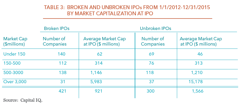
Similarly, smaller companies were more likely to lead to a broken IPO. Among the largest companies, with a market capitalization at IPO of over $3 billion, more IPOs were unbroken (37) than broken (31).
Among companies in all of the other market capitalization groups, more IPOs were broken than unbroken. This is most pronounced in the smallest market capitalization group, under $150 million, in which 67% of the IPOs were broken. In the other market capitalization groups, between $150 million and $3 billion, about 55% of IPOs were broken.
Smaller companies not only had broken IPOs more often, they also broke “harder”. Overall, unbroken IPOs experienced a median return of 51.3%, compared to a median return of -36.6% for broken IPOs (Chart 2). This of course makes sense, as broken IPOs have a negative return as of the date of the analysis.
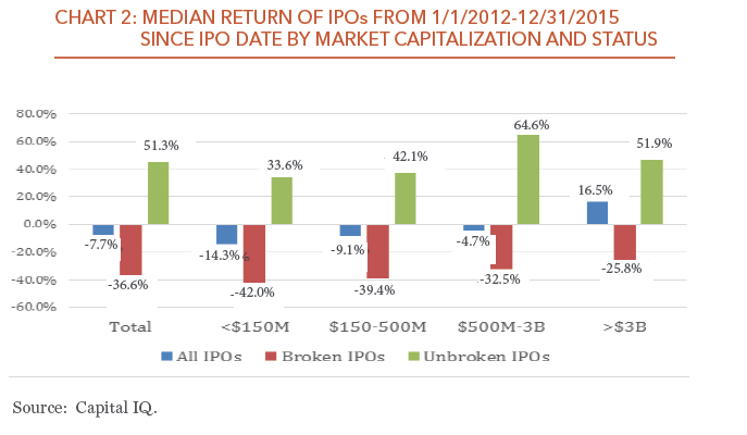
These returns vary by market capitalization of the company. The smallest companies, under $150 million in market capitalization, saw returns of -42.0%, compared to -25.8% for the largest companies (over $3 billion).
IPO Timing Influences Performance
By timing, in this analysis we mean the calendar year of the IPO. This view suggests that in some years, IPOs are higher- or lower-quality than in other years. Companies and their bankers may bring some IPOs to investors based on the environment for IPOs, rather than on the inherent value of the IPO.
IPOs from 2012 have generally performed best. While the median return was slightly negative, the average was very high, with a small number of outstanding performers (Chart 3).
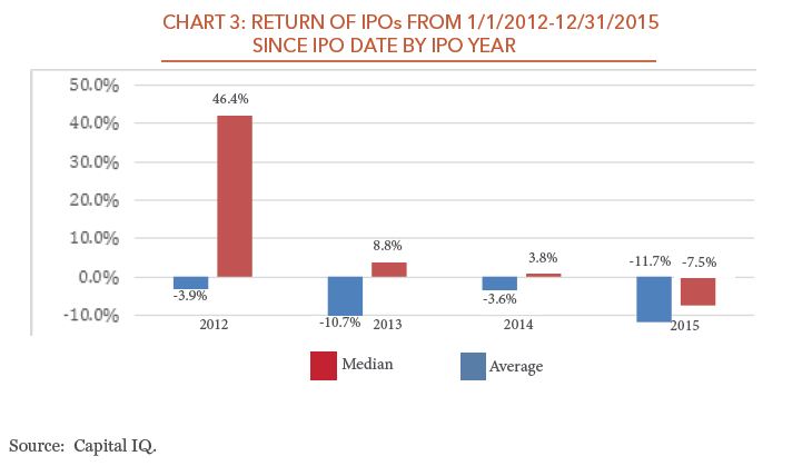
In contrast, IPOs from 2015 performed much worse than those in the other years represented in the data set.
IPO Performance Varies by Industry Segment
Among the various industry segments represented, healthcare dominates the data set with 231 IPOs, financial services (157 IPOs) and information technology (114 IPOs) also account for a significant number of companies. About three-fourths of these IPOs are biotechnology or pharmaceutical companies, with the most speculative technology companies. These healthcare IPOs performed worse than any other segment with meaningful representation in the data set, other than energy (Chart 4).
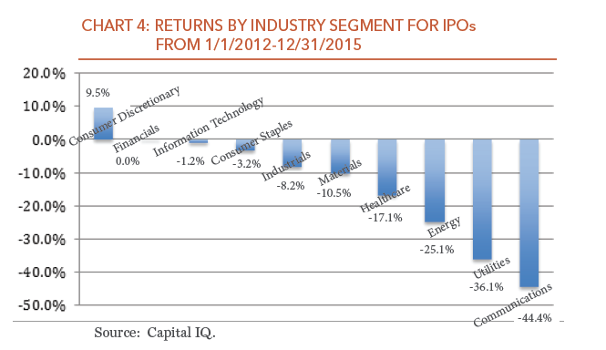
In this analysis, utilities and telecommunications services together include only 13 IPOs, about 2% of the total. The remaining segments, outside of healthcare and energy, delivered a median return that was only slightly negative, suggesting that the large number of healthcare IPOs drove much of the poor performance overall.
Valuation Drives IPO Performance
The final and most important dimension of performance is valuation at the time of the IPO. There are many ways to define value. For this analysis, we use the ratio of total enterprise value (TEV) to revenues.
Earlier, we saw that the median valuation for the entire data set at the time of IPO was 5.8 (See Table 1). The median has since declined substantially, to 2.3. Within the data set we see significant variation in valuation along many of the other attributes we reviewed here.
The IPOs with the lowest valuation have performed best. Among all the IPOs, the ones in the first (lowest) quartile of valuation are the only companies with positive returns since the IPO date (Chart 5).
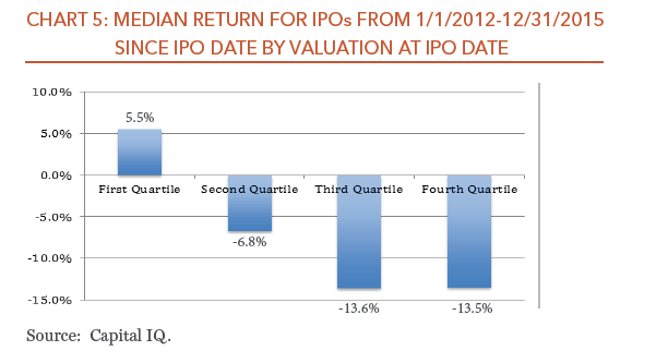
Half of the IPOs, (the third and fourth quartile of valuation) had a median return around -13%.
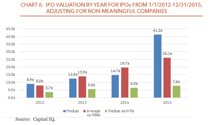
We also analyzed valuation by year. For this analysis, we removed companies with zero revenues, which we deem as nonmeaningful. With these companies, the median valuation increased steadily from 2012-2014, and then dramatically in 2015 (Chart 6). Without these companies, median valuation increased substantially from 2012 to 2013, and then steadily from 2013-2015.
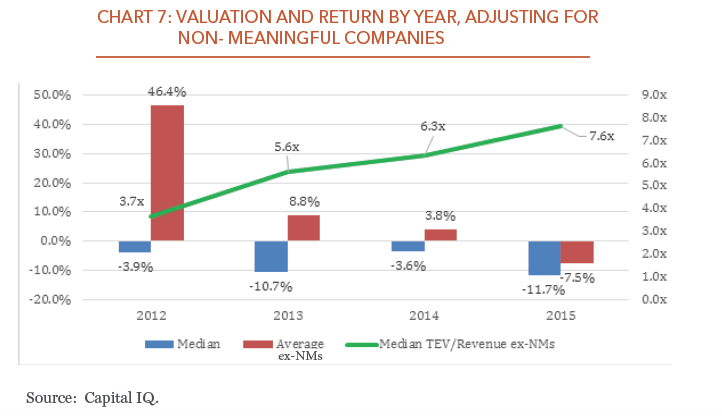
Finally, we compare valuation to return directly, by year. Based on this analysis (Chart 7), as valuation increased each year, median and average returns declined over time.
Conclusion: Investment in IPOs Can Work Well
With the proper approach and analysis, IPOs represent a sound investment. Looking at IPOs by market capitalization and industry segment helps to narrow and focus the decision about whether a given IPO makes sense.
Above all, we think it demands discipline about valuation and timing. That discipline distinguishes between an IPO that has reverted to a sensible valuation at the right time, and one that is unlikely to deliver any value over any foreseeable time frame.
Valuation: IPOs frequently begin at lofty valuations, and then soar higher. Even if they don’t break below the IPO price, they may return to a more sensible valuation and thus become a more viable investment. When they do break below the IPO price, they often become even more attractive.
Timing: As with much else in investing, timing is everything. An IPO that breaks too soon could represent a poorly-priced IPO, or a fundamentally poor investment.
At Perritt Capital Management, we apply this philosophy and process to all investments, and specifically to IPOs. We watch IPOs closely, with rigorous tracking databases and sophisticated metrics. As we have shown, we aim to avoid IPOs at launch, when other investors flock there, valuation soars, and the underlying business remains unproven. When valuation reaches appropriate levels, and we know more about cash flow and profitability, we make an educated decision about adding an IPO company to our portfolio.
Overall, IPO investing is like any other equity investing. It demands analysis and discipline, and close attention to valuation.
(1) Ritter, Jay R., “The Long-Run Performance of Initial Public Offerings”, The Journal of Finance, Vol. XLVI, No. 1 (March 1991), p. 3-28
(2) Ritter, Jay R. and Ivo Welch, “A Review of IPO Activity, Pricing, and Allocations,” The Journal of Finance, Vol LVII, No. 4 (August 2002), p. 1795-1828
Manager Commentary, 4th Quarter 2015
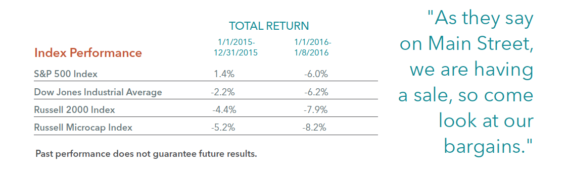
WALL STREET PUTS STOCKS ON SALE
As they say on Main Street, we (retailers) are having a sale, so come look at our bargains. I have always found it fascinating that sales in retail or Main Street are met with cheers and excitement, but sales on Wall Street are met with gloom and depression. Before we consider the “bargains” on Wall Street, let’s take a look at how the stock market has performed recently.
As measured by the S&P 500 Index and the Dow Jones Industrial Average, large stocks experienced their biggest fall ever for the first five trading days of January and the worst for any week since September 2011. The Dow Jones Industrial Average lost 6 percent and the S&P 500 Index lost 6.2 percent in the first week (1/1-1/8/16) of January 2016. Thanks to dividends, the S&P 500 Index eked out a 1.4 percent gain in 2015, but the Dow lost 2.2 percent. Smaller stocks fared even worse. The Russell 2000 Index lost 7.9 percent in the first week of January while the Russell Microcap index lost 8.2 percent. These declines came after losses in 2015 for both the Russell 2000 Index and the Russell Microcap Index. As we have said several times in the past, the small-cap market has been in a stealth bear market, but this decline in the Russell Microcap Index officially puts that index in bear market territory. The complete index performance numbers can be viewed in the table below.
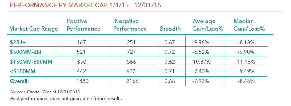
Here is a review of the breadth of the smaller-cap market. As the table below indicates, the average stock once again performed worse than that of the small-cap indexes. The table shows that 2,166 stocks declined last year and 1,480 stocks rose last year. The table does not show that the majority of stocks that rose last year were lower quality stocks in our opinion. In addition, the majority of the 2,166 stocks that declined last year were very severe. In other words, the majority of the declines were in the bear market zone (greater than 20%).
SECOND HALF QUALITY COMEBACK
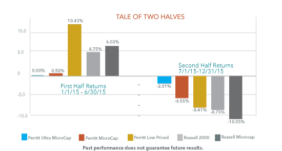
The small and micro-cap stock market in 2015 can be viewed as a tale of two halves. Small-caps (Russell 2000) posted 4.8% return in the first half of the year (Jan-June) and -8-8% in the second half (July-December). Micro-caps (Russell Microcap Index) also gained in the first half (6.0%) before falling harder in the second half (-10.6%). Looking under the hood, investors will find that high quality companies (positive EBIT, dividend, positive earnings growth) led the way in the second half, potentially signaling a shift in the market toward value. Lower quality companies (negative EBIT, no dividend, negative earnings growth) drove returns in the first half when biotech and internet companies were far in favor.
We believe recent trends bode very well for active managers of small- and micro-cap stocks. The biotech segment of the market has started to show signs of stress, dragging index performance down with it. As we started to see in the second half of 2015, active managers that focus on quality companies can provide investors downside protection. And there are many opportunities with attractive valuations, as we discuss next.
Why have stocks declined severely recently? There are certainly some weakness in some economic indicators, but not all indicators. For example, the Purchasing Managers’ Index ticked below 50, which can be an indication of future weakness in the economy. However, jobs creation and unemployment has both been moving in a positive direction. The Federal Reserve finally raised interest rates last month, which some say could slow growth further. We, however, believe that a one-quarter interest rate hike or even a couple more will have very little impact on the economy. The real decline in stocks, in our opinion, is related to the China market. While the China market does have an impact on the world economy, we believe smaller stocks are not influenced by the China economy. In fact, the majority of the companies in our portfolios have no exposure to China. This brings us back to one of the “bargains” on Wall Street.
Our largest holding firm wide is Atlas Financial (AFH), which is the largest insurance provider to cab companies and other transportation companies (yes, they do some business with Uber). Not only do we see no impact from China, we believe AFH’s business will be hardly hurt from a weaker economy. The company’s stock has declined recently by more than 15 percent from its recent high, but the business in the past few years has grown well in excess of 20 percent, and we don’t see that growth rate stopping. AFH shares trade for a little more than 10 times 2016 earnings estimates as of 12/31/2015.
As I said earlier, Wall Street sales are typically met with gloom. A look at domestic equity flows gives us some insight on this phenomena. According to Investment Company Institute, domestic equity flows were negative by $170 billion in 2015, and negative by $60 billion in 2014. While the large-cap market did well in 2014, the last year smaller-cap stocks did well was in 2013. It does not surprise us that the domestic equity flows in 2013 were modestly positive by $18 billion. The more interesting part of the flows are in the trends. A deeper look shows that the domestic equity flows only started to turn positive late in 2013, after the markets had rallied. Today, the domestic equity outflows have been accelerating. The weekly domestic equity flows have been in excess of $5 billion several times recently, which means we could be on pace for more than $200 billion annually in domestic equity outflows, just as we enter bear market territory. Once again, this behavior does not surprise me, but it seems odd given the bargains on Wall Street. So, lets look at the “bargains”.
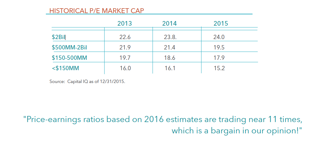
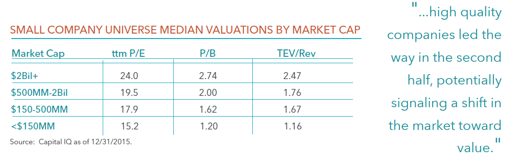
Regardless of the valuation characteristics you use, valuations are more attractive for smaller-cap stocks versus that of larger-cap stocks. The table above breaks down the smaller-cap market by market-cap buckets. While the valuations for smaller stocks are not the lowest in history, they are more reasonable than larger stocks. For example, companies with market caps above $2 billion trade at price to book values near 2.7 times, while companies with market-caps less than $500 million trade at less than 1.6 times book.
Valuations also look more attractive for smaller stocks from just a few years ago. The table below shows the price earnings ratios of those stocks by market-cap buckets for the past three years. These valuations don’t take into account the 8 percent decline in the first week of January 2016. So, the two smallest market-cap buckets are now estimated to be trading at price-earnings ratios of 14 or less. In addition, according to Capital IQ, analysts estimate that earnings will grow well into the double digit levels this year. Therefore, price-earnings ratios based on 2016 estimates are trading near 11 times, which is a bargain in our opinion!